Why a High-Converting Landing Page Matters
Key Elements of a Successful Plumbing Paid Ads Landing Page
Designing a Form That Converts
The Power of Visual Design in Plumbing Landing Pages
CTAs That Make Money While You Sleep
Common Mistakes to Avoid When Creating a Plumbing Landing Page
Tools to Create and Manage Your Plumbing Landing Page
Conclusion & Action Steps
FAQ
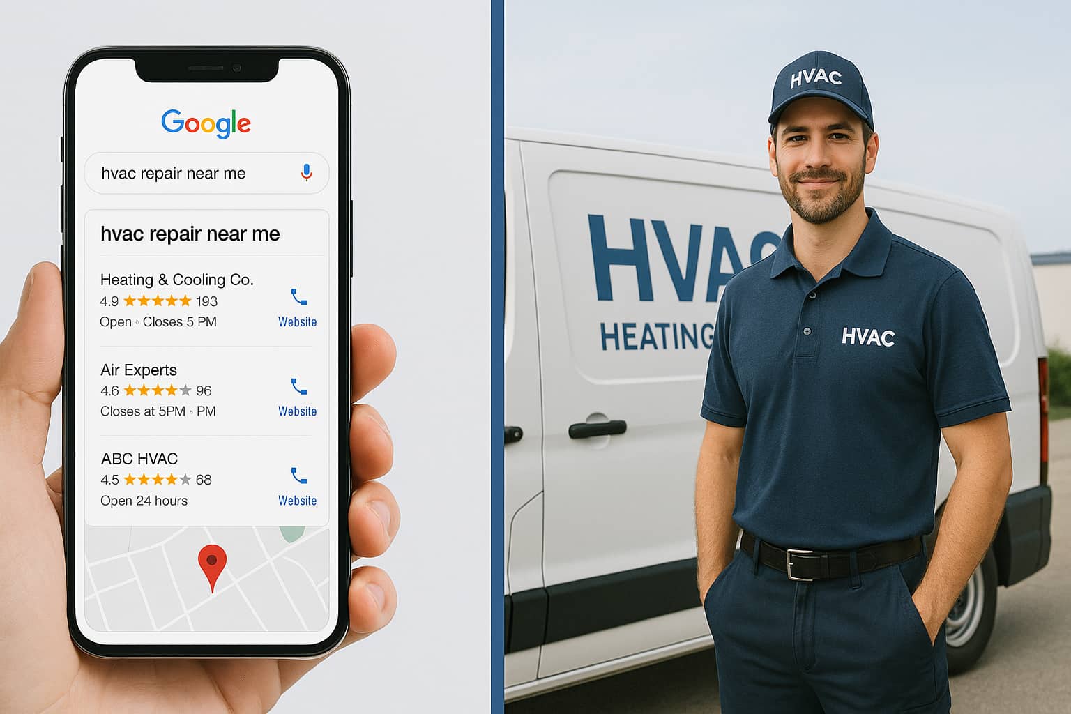
What if over 50% of the people that saw your ad, became a lead? How many calls would that bring in and how many booked jobs would you have for the month?
A high converting plumbing paid ads landing page can do that for your business.
It can:
Turn inconsistent months into steady, predictable cash flow every month.
Turn dead end leads into hungry customers that only want to work with you.
Transform your plumbing internet marketing campaigns into money printers with the click of a button.
Force your competitors to copy your business strategy, fearing going out of business.
Funnel people into giving you their contact information while you sleep soundly, knowing when you wake up, you’ll have your entire schedule fully booked.
Warning: This is only for plumbing business owners who want more work, faster scaling, and bigger cash flow.
High converting landing pages are the backbone of any plumbing paid ads strategy. Without an optimized plumbing paid ads landing page, you may as well be setting money on fire.
Landing pages are designed for one job and one job only: Capture leads by any means necessary.
Want to know how important a well optimized landing page is?
You can have the best SEO strategy in the world, the highest CTR on your Google ads, but if your landing page is trash, say goodbye to those leads.
While you're optimizing your paid ads landing page, don't neglect organic search traffic. Learn how to get more plumbing leads using SEO to capture free, long-term customers.
Having between 21 and 40 landing pages can increase conversions by almost 300%. This blog will teach you how to make 1 incredible landing page by following the same first principle secrets that billion dollar companies like Nike and Apple use.
If you're still exploring other ways to bring in calls, this guide outlines three simple strategies for plumbing leads.
Here’s how to transform your plumbing lead generation overnight.
Picture this: someone’s basement is flooding, their toilet sounds like a dying walrus, and they’re frantically Googling “plumber near me.” Your headline is your one shot to scream, “I’M HERE TO SAVE YOU!”.
First and foremost, what is the first thing a person sees when they land on your page?
The headline. You need a great headline to get people to stay on your landing page.
The goal of a headline is to showcase your offer in BIG bold letters and create enough of a reason for someone to stay, read, and fill out your lead form.
Let’s do an exercise together. Which headline do you think would perform better?
Example 1: The Best Plumber in Town
Example 2: The #1 Rated Plumber in Santa Monica | Same-day appointments available now!
If you picked example 2, well done.
A great headline is made up of 3 core ideas, otherwise known as CUS:
Credibility
Imagine you’re stranded with a burst pipe. Are you clicking on “Bob’s Plumbing” or “500+ 5-Star Reviews | Voted ‘Best Emergency Plumber’ by Local Gazette?
Exactly. Numbers, awards, and reviews are your golden tickets to trust. They’re the equivalent of showing up to a job interview with a toolbox full of trophies.
Urgency
Homeowners aren’t browsing plumbing sites for fun. They’re in crisis mode. Your headline should slap them with a solution. “Same-day repairs” screams urgency. Skip the bland “quality service” and focus on what they actually* want: their problem gone, fast.
Specificity
“Santa Monica” instantly tells locals you’re their neighbor, not some faceless corporation three states away.
“Same-day appointments” addresses the panic of “I need this fixed NOW.” Generic claims like “best plumber” are like saying “trust me” to a stranger. No one buys it. But toss in a location, a specific offer, or a quirky benefit (“We’ll Fix Your Pipes Before Your Mother-in-Law Notices”), and suddenly, you’re speaking their language.
Vagueness
Vague headlines are the kryptonite of conversion. Saying you offer “quality plumbing services” is like telling someone you’ll “fix their problem” - what problem? Homeowners aren’t searching for a vague handyman, they’re searching for a hero to solve specific nightmares: a flooded basement, a toilet that’s become a geyser, or broken pipes.
Forgetting the Offer
A great offer answers four questions in simple, third-grade-level language.
Perceived Likelihood of Achievement: “Can they actually fix this?” → “500+ 5-Star Reviews.”
Dream Outcome: “What’s my life like after?” → “No More Midnight Toilet Concerts.”
Speed: “How fast?” → “Same-Day Repairs.”
Sacrifice Required: “What’s the catch?” → “No Extra Fees. No Upsells. Just Fixed Pipes.”
Example: “Get Your Pipes Fixed TODAY—No Wait, No Hassle’”
This works because it’s clear, concise, and addresses the homeowner’s hidden fears and perceived sacrifices.
Answer those 4 questions, and you are well on your way to building a high converting landing page for your plumbing business.
Jargon Overload
Stop sounding like a plumbing textbook (unless you want to bore customers to tears)
Homeowners don’t care about “hydro-jetting lateral line obstructions”. They care about “Will you unclog my drain?” Jargon doesn’t make you sound smart, it makes you sound out of touch.
Write like you’re explaining the problem to a third grader:
Bad Example: “We Specialize in Advanced Pipe Descaling and Hydrostatic Testing.”
Good Example: “We Fix Your Clogs So You Can Stop Playing ‘Guess That Smell’ With Your Drains.”
Simplify technical terms into relatable benefits.
The rule? If your grandma wouldn’t understand it, rewrite it.
If your headline doesn’t pass these questions, flush it and start over:
Does it scream local? (Replace “local plumber” with your city.)
Does it solve a specific problem? (Leaks, clogs, emergencies?)
Would it make a sleep-deprived homeowner at 3 AM think, “THANK GOD”?
Your landing page form is where conversions happen. But if it’s too complicated, too long, or buried at the bottom of the page, potential leads will leave without taking action. The goal is to make it fast and effortless for customers to reach you.
- Name (so you can personalize follow-ups)
- Phone Number (so you can contact them quickly)
- Service Needed (so you know what they need before calling back)
- Zip Code (Optional) (helps if you only serve specific areas)
- How did you hear about us? (multiple choice to gather data on best advertising channels)
Avoid unnecessary fields like full addresses or long message boxes questions. People won’t fill them out, and every extra step reduces conversions. A good rule of thumb is three to four fields max, multiple choice questions.
The placement of your form matters as much as its content. If users have to scroll down and search for it, you’ll lose leads.
Here’s where it works best:
Above the Fold (Right Side of the Header) – The first thing visitors see, making it easy to take immediate action.
Our Example:
Example:
At the Bottom – A backup for visitors who read the full page but should never be the only form placement.
Example:
For the best results, use at least two forms: one at the top and another in the middle of the page where visitors naturally pause.
Not all customers want to fill out a form. Some prefer calling, others prefer texting, and some want to book online without talking to anyone. Give them multiple ways to reach you.
1. Click-to-Call Button (For Immediate Action)
If someone’s dealing with a burst pipe or an overflowing toilet, they won’t waste time filling out a form. A prominent, clickable phone number should be one of the first things they see.
- Place it above the fold so they can call instantly.
- Use clear text like “Call Now for Emergency Service” or “Contact Us.”
- Ensure it’s tap-to-call enabled on mobile—no one should have to copy and paste a number.
2. Live Chat or Text Messaging (For Those Who Prefer Not to Call)
Some customers don’t want to talk on the phone, especially if they’re at work or just shopping around. A live chat feature or text option gives them another way to connect.
Live chat should have real response times under 30 seconds to keep them engaged. A texting option (e.g., “Text a Plumber Now”) allows customers to get a response without calling.
3. Request a Callback (For Non-Urgent Inquiries)
Some leads aren’t in a rush but still want a plumber to follow up. A “Request a Callback” form lets them submit their number and get contacted at a time that works for them.
Add a promise like “We’ll call you back within 10 minutes” to set expectations.
Use a simple form with just name, phone number, and preferred callback time.
4. Online Booking System (For Those Who Want to Schedule Without Calling
Many customers, especially younger ones, prefer self-scheduling over calling. If you use Jobber, Housecall Pro, or Calendly, add an online booking option.
Show real-time availability to reduce back-and-forth communication. Keep the process simple. Just let them select a time and enter their phone number.
The easier you make it for customers to contact you, the more leads you’ll get. If a homeowner with a plumbing emergency can find your CTA and take action in three seconds or less, your landing page is doing its job.
The next step in your journey to an incredible plumbing landing page is the actual design.
Visuals on a landing page are like butter and the text is bread. No one wants plain bread.
Let's turn your landing page into a lead-generating machine that makes competitors wonder what kind of black magic you're using.
The Hero Section (AKA Your Digital First Impression)
Your hero section (what they see with one scroll) is like a dating app profile and you've got about 3 seconds before they decide to swipe left or right. Here's what needs to happen in those precious seconds:
Slap them with a crystal-clear image of your team looking like plumbing superheroes (uniforms pressed, trucks shining, tools gleaming)
Show a "before/after" of a plumbing nightmare you fixed (bonus points if it looks like something from their worst homeowner nightmares)
Include an actual human face – preferably someone smiling.
If a picture is worth a thousand words, a video is worth a thousand leads. People trust what they can see and hear. A 30-second video can communicate more about your business than a full page of text.
Emergency Response Footage – Show a real job in action, proving your speed and professionalism.
Team Introduction Clips – A simple, friendly video of your team shaking hands with customers and introducing themselves.
Customer Testimonial Videos – Raw, unscripted, and authentic customer reviews.
Time-Lapse Job Transformations – A sped-up clip showing a major repair from start to finish.
Keep it short (between 30 seconds to 2 minutes).
Use natural lighting and avoid shaky footage.
Focus on customer emotions – a relieved, happy homeowner says more than words ever could.
Use captions so users can watch without sound.
Plumbers who implement video marketing on their landing pages see significantly higher conversions. That’s because video builds trust instantly.
87% of people have been convinced to buy a product or service by watching a video.
Think of trust badges like Pokemon cards because you gotta collect them all:
- Google reviews badge (with that sweet 5-star rating)
- BBB accreditation (because it still matters to worried homeowners)
- Any industry certifications (show off those fancy plumbing diplomas)
- Local business awards (even if it's "Best Plumber in Cincinnati 2023" from your local paper)
But here's the secret sauce: Don't just slap them anywhere. Position them right below your hero section where they can't be missed, like a neon sign saying "We're the real deal!"
To maximize your Google reviews and build the local credibility that makes your landing page convert, discover how to build a plumbing Google Business Profile that dominates local search.
Remember that time you fixed Mrs. Johnson's flooding basement? That's gold. Create what I call the "Transformation Trifecta":
1. The Disaster (the "oh crap" moment)
2. Your Team in Action (looking professional, not like the guy from Super Mario)
3. The Happy Ending (clean, fixed, and looking better than new)
When someone's bathroom is doing its best Niagara Falls impression, they're probably on their phone. Your mobile visuals need to be:
- Thumb-friendly (buttons big enough for panicked clicking)
- Lightning-fast loading (no one's waiting 5 seconds when there's water everywhere)
- Clear as crystal (blurry images = bye-bye customer)
For those emergency moments we talked about:
Add a pulsing "Emergency Service" button that catches the eye without causing seizures.
Show a live "Response Time" tracker (nothing says "we've got you" like "Next available: 15 minutes").
Include a chat widget in the corner of the page with an actual photo of your dispatcher (not some generic stock photo).
Your footer (the bottom of the page) should be like a greatest hits album of trust:
- Payment methods (because people love options)
- Insurance badges (nothing says "we've got you covered" like... well, coverage)
- Service area map (show them you're not operating from a van down by the river)
Need help figuring out which visuals to tackle first? Just imagine what you'd want to see if your own house was flooding at midnight. Start there, and you can't go wrong.
Let's get nerdy about CTAs (call-to-action) and plumbing internet marketing for a minute, because this is where the rubber meets the road – or in our case, where the cursor meets the cash register.
Your CTA is like a neon sign in Vegas. It needs to be so obvious that even someone who's had a few too many can't miss it.
A CTA is the button someone presses to get the conversion you want. It can be a call button, a submit form button, or a continue to another page button.
Everyone thinks "make it red!" and calls it a day. But hold your horses. Color is about emotion, not attention. Here's what science says actually works:
Orange (#FF9900): Creates urgency without screaming "PANIC!" Perfect for emergency services.
Deep Blue (#0066CC): Builds trust. Ideal for scheduling regular maintenance.
Green (#33CC33): Suggests prosperity and progress. Great for money-saving offers.
Your button should have at least a 70% contrast ratio with the background. Test your button against both light and dark sections of your page. If it disappears anywhere, you're leaving money on the table.
Too long and they'll skip it. Too short and they won't click it.
Your CTA needs to be like a perfect cup of coffee – just right.
Desktop CTAs should be 2-5 words (14-35 characters), while mobile CTAs need to be snappier at 2-3 words (10-20 characters). Always format phone numbers like this: (555) 123-4567.
Winners That Actually Convert:
✅ "Fix My Plumbing Now!"
✅ "Get Free Quote "
✅ "Submit"
The losers?
❌ "Click Here to Schedule Your Free No-Obligation Quote Today!" (too long),
❌"Please Submit Now" (too desperate)
❌"Learn More About Our Amazing Services" (too wordy).
Layer your plumbing landing page elements like a perfectly made sandwich.
Start with an urgency headline ("Limited Emergency Slots Today!"), add your value proposition ("Fixed in 60 Minutes or Less"), slap on that CTA button ("Get Emergency Service"), and finish with a trust booster under the CTA in small text ("No Extra Charge for Nights & Weekends").
Ever notice how some websites have a phone number that stays at the top of your screen no matter how far you scroll? That's a "sticky" CTA. Think of it like a post-it note that never falls off – it's always visible, always ready for action.
Here's what your mobile landing page needs:
- A phone number that stays locked at the top or bottom of the screen, even when scrolling (that's what "sticky" means)
- The phone number should instantly call your business when tapped (no copy and paste needed)
- Make it big – aim for at least the size of two fingers wide and one finger tall
Your phone number needs to be so obvious and easy to tap that they could do it while juggling those leaky pipe problems. If they have to hunt for your contact info, they're calling the next plumber on Google.
If people aren’t clicking, your landing page is failing at its one job: getting leads. But how do you know if your CTA is actually working?
The 5-Second Test
A simple way to gauge the effectiveness of your CTA is to run a 5-second test:
Show your landing page to someone unfamiliar with your business.
Ask them:
What does this page want you to do?
Where would you click first?
If they hesitate, struggle to find the CTA, or click somewhere else, your button needs improvement.
If your CTA doesn’t immediately grab attention and make it obvious what action to take, potential leads will bounce.
A gut feeling is not a marketing strategy. Data is everything. Instead of guessing whether your CTA is performing, you need concrete numbers.
With Google Analytics, you can track:
Click-Through Rate (CTR): How many people are clicking your CTA.
Conversion Rate: The percentage of visitors who complete the form after clicking.
Bounce Rate: If people land on the page but leave without clicking anything.
How to Set It Up in Google Analytics (GA4):
Go to Google Analytics and navigate to Events.
Set up an Event for CTA clicks using Google Tag Manager.
Track form submissions to see if clicks actually lead to conversions.
Goal:
If your CTA conversion rate is under 15%, it’s underperforming.
30%+ means you're crushing it.
Anything between 15-30% is okay but can be improved.
Use Hotjar or CrazyEgg to see exactly where users are clicking on your page.
What to Look For:
Are visitors clicking on the CTA or ignoring it?
Are they clicking somewhere else instead? (Bad design could make another element look more like a button.)
You don’t have to guess what works, but test different CTA variations.
How to A/B Test Your CTA:
Change one element at a time:
- Button color
- Text copy ("Get a Free Estimate" vs. "Book Service Now")
- Placement (Top, Middle, Sticky Button)
Run traffic to both versions.
Track which converts better using Google Analytics.
If your data shows a low CTA conversion rate, try these quick fixes:
Make It Bigger: A tiny button is easy to ignore.
Improve Visibility: Use contrasting colors that pop.
Change the Wording: Test direct, action-driven phrases.
Reduce Friction: If your CTA leads to a long form, shorten it.
Add Social Proof: Place reviews near the CTA to build trust.
A bad landing page is like a leaky faucet. It constantly drips away potential customers and money.
And the worst mistake?
Sending ad traffic to your homepage instead of a dedicated plumbing paid ads landing page. That’s like telling someone who needs emergency pipe repair to browse your entire "About Us" page before they find your contact info.
Spoiler: they won’t. They’ll leave.
A landing page has one job: turn visitors into leads. If you're spending money on plumbing internet marketing, every click needs to count.
Here’s what to avoid:
Overloading the page with too much text
Homeowners don’t need a dissertation on the history of pipes. They want fast solutions. Keep the copy clear, concise, and focused on the action.
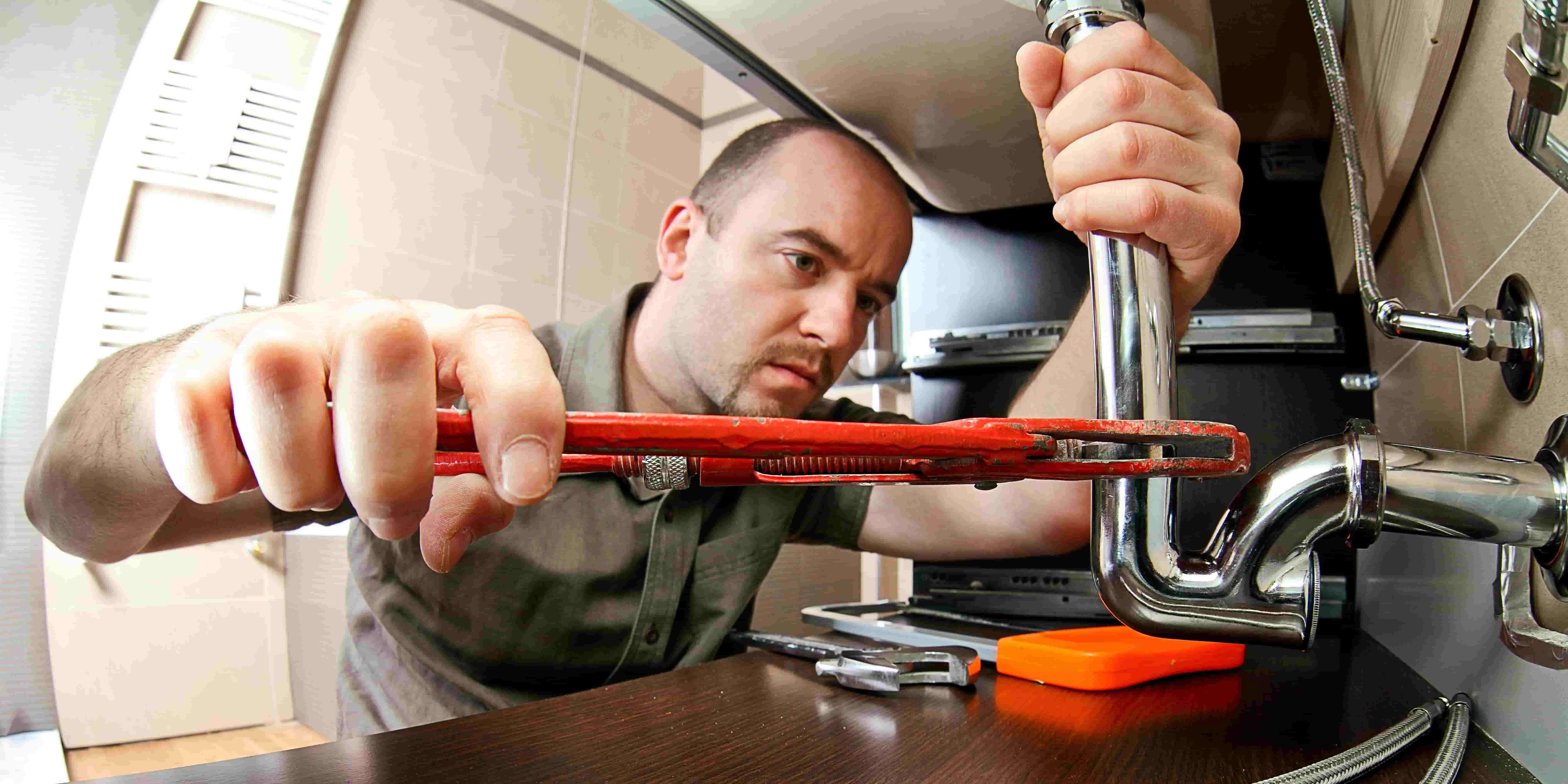
Using stock photos instead of real images of your team
If your landing page features a guy in a perfectly clean jumpsuit smiling at a pipe, customers won’t buy it. Real photos = real trust. Show your actual team, tools, and trucks.
Missing critical trust signals (reviews, certifications, awards)
If you don’t brag a little, how will customers know you’re the best? Plaster those 5-star reviews, BBB accreditation, and “Voted Best Plumber” badges all over the page.
Hiding or burying the CTA
If customers have to scroll, search, or solve a puzzle to find the "Call Now" button, you’re losing leads. Make CTAs big, bold, and impossible to ignore.
Not optimizing for mobile
Over 60% of website traffic comes from mobile devices.
If your page loads like it’s stuck in 1999 or your CTA button is smaller than a baby’s fingernail, say goodbye to conversions. Mobile users should tap, call, and book within seconds.
Now that we’ve covered how to make a great landing page, I need to tell you the tools you’ll need and how to check if you’re making progress. Without the right setup, you're throwing money down the drain.
WordPress + Elementor Pro ($49/year) → Flexible, budget-friendly, but requires setup.
ClickFunnels ($97/month) → Drag-and-drop builder with A/B testing for higher conversions.
Instapage ($149/month) → Best for high-budget campaigns that need serious performance tracking and advanced marketing features.
Implementation Steps:
Choose a platform and register your domain.
Pick a conversion-optimized template (don’t reinvent the wheel).
Add real photos, killer CTAs, and trust signals.
Building a landing page is only half the battle. You need to track how it’s performing, or you’ll never know what’s working and what’s leaking leads.
Google Analytics - See how many visitors hit your page, where they drop off, and what’s converting.
Hotjar or Crazy Egg - Heat Maps show where users click, scroll, and bounce. If they ignore your CTA, you’ll know why.
Implementation Steps:
Install Google Analytics and track conversion rates.
Use heatmaps to see where visitors interact the most.
Tweak your landing page based on real data—not guesses.
Action Step 1
Create a dedicated plumbing paid ads landing page that focuses on a single goal: capturing leads. Eliminate distractions like extra navigation links and feature a clear headline, trust badges (such as BBB accreditation), and real photos of your team.
Action Step 2
Set up Google Analytics and heatmaps to track visitor behavior, identify where they click, and measure which elements drive the most conversions.
Streamline your contact form and CTAs to boost plumbing lead generation. Limit fields to essentials like name, phone number, and brief service details. Offer multiple ways to reach you, such as click-to-call buttons, live chat, and text options. Use short, action-driven phrases like “Fix My Plumbing Now” to guide visitors toward immediate action.
Action Step 3
Optimize everything for mobile users who often have urgent plumbing issues. Make sure your landing page loads quickly, with key CTA buttons visible at all times. Continuously A/B test different headlines, images, and button colors. Use real data—not guesswork—to refine what works and improve your conversion rate over time.
Bonus Tip: Once your landing page is generating consistent leads, maximize the revenue from each customer. Learn how to grow your plumbing business revenue with tiered service packages to increase your average job value.
If you'd like to skip the hassle and get more pay per call plumbing leads today, sign up for free with ResultCalls!
Q. Why do I need a dedicated plumbing paid ads landing page instead of my homepage?
A.
Laser-Focused Conversions
A dedicated plumbing paid ads landing page targets one specific goal: turning visitors into leads. By contrast, a homepage often has multiple links and distractions, diluting your conversion rate.
Optimized for Plumbing Internet Marketing
When you run plumbing internet marketing campaigns, sending traffic to a single offer (like a free estimate) ensures higher conversions. A dedicated page helps you track and optimize your ads more effectively.
Better User Experience
A landing page designed around urgent plumbing needs (burst pipes, clogged drains) makes it easier for potential customers to find your CTA, fill out a form, or call you directly—no scrolling or searching required.
Reduced Bounce Rates
People with plumbing emergencies want immediate solutions. A straightforward landing page with clear headlines and trust signals keeps them from leaving for a competitor’s website.
Q. How many form fields should I include to boost plumbing lead generation?
A.
The fewer the fields, the higher the conversion rate. Essential fields usually include name, phone number, and service needed. Anything more can feel like a chore and push prospects away.
Focus on Urgent Needs
Ask about the specific plumbing problem (e.g., leak, clog, water heater issue) to tailor your response. This also shows you’re ready to offer a quick solution.
Use Multiple Choice
If you need extra info—like "How did you hear about us?"—make it a simple drop-down or checkbox. This speeds up form completion and helps you track your plumbing internet marketing results.
Offer Multiple Contact Options
Not everyone wants to fill out a form. Include a prominent Click-to-Call button, Request a Callback form, or Live Chat feature to accommodate different preferences.
Q. Should I use stock photos or real images on my plumbing paid ads landing page?
A.
Build Trust with Real Photos
Authentic images of your plumbing business—like your team, vehicles, and actual job sites—create credibility. Homeowners trust local experts who show their real faces and equipment.
Demonstrate Expertise
Show before-and-after pictures of successful plumbing jobs. This visual proof of your skills can significantly boost plumbing lead generation by reassuring customers you can fix their problem.
Highlight Your Team
Include images or short videos of your friendly, professional staff. Seeing the real people behind the brand humanizes your high-converting landing page and can increase conversions.
Leverage Video Testimonials
A quick video of a satisfied customer praising your fast response or high-quality work can outperform any stock photo. Video builds immediate trust and can dramatically improve CTA clicks and form submissions.

Hello everyone! My name is Alex and I write these blogs to help educate small business owners on different ways to grow their business. My goal is to make lead generation as easy as possible for you. After reading these blogs, I hope you leave with some actionable steps that will get you closer to growing your business :)